
Google promised improvements in its tools and design for Direct Share on Android, the interface or design for Sharing that can be disabled due to its lags (so o so). These changes are already rolling out in various apps. On Maps they have already been applied and users can check them for themselves. Now some are reporting that these same changes are occurring in other apps, as is the case with Google Photos.
These changes consist in that the tiles of the Contacts In the drop-down that opens when sharing a photo (or a location or local, in the case of Maps) they are replaced by two menus slideable and horizontals in which these tiles appear in a space more compact, making it possible for the image (or file or link) to be shared to be better appreciated on the screen.
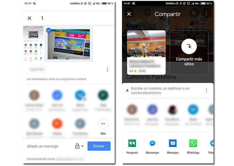
In the image on the left you can see the classic design in Google Photos, with two lines of shortcuts to contacts, while in Maps the new design appears, with two sliders, one for contacts and others for sharing via apps.
In short, it is an improvement for the Direct Share function that has caused so much controversy among Android terminal users and that can be deactivated as we detailed in these two tutorials, the first without flashing the terminal and the second using a recovery like TWRP.
Although Google announced its promises when talking about future versions of Android, the truth is that these improvements are already being implemented in Android users, whether they have the latest version (Android 9 Pie) or previous (8 or 8.1 Oreo).
What improvements does the new Direct Share design bring?
Google's goal with these changes is to reduce the small lag caused by contact loading more frequent or recent when it comes to showing their shortcuts when sharing content with any of the official Google apps.
While users are already reporting that these changes are gradually appearing in the Google Photos application, where the option to share takes on a special relevance (remember that it is the favorite app for many when it comes to managing multimedia files or making albums collaborative), it is in Google Maps where everyone can appreciate these modifications to the interface.
Those who have noticed this particular redesign have found it in the terminals Pixel3, While as we said, in the case of Maps, this modification appeared at the end of last year in the entire Android community.