Material Design has been the main design guide for Android interfaces for the past four years. Despite this, not all lines are followed as they should, and Google work already in Material design 2 to relaunch the visual aspect of your operating system.
Google is already working on Material Design 2: evolution, not revolution
Google launched Material Design in a quest to optimize and homogenize the appearance of Android. Design lines based on flat colors and a clear content structure should serve to make the experience of using all the apps in the ecosystem similar, apart from particularities. This would make life easier for the user and, incidentally, everything would look more beautiful.
However, the passage of time has shown that this is not always the case, and even the Google breaks their rules from time to time. Now, four years later, the company is working on Material design 2, and it seems that it will be an evolution with which refine and shore up design guides, and not a revolution that collapses everything and starts again.
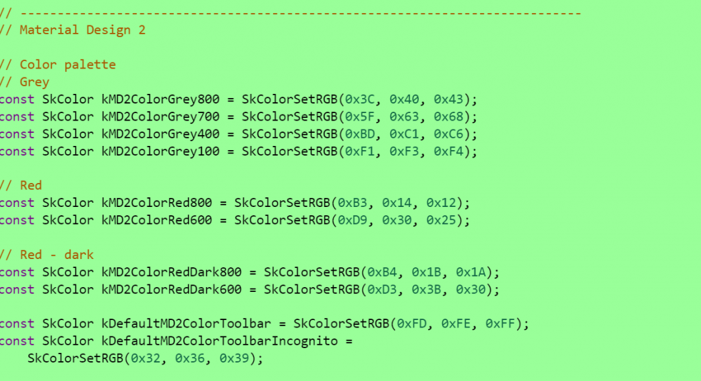
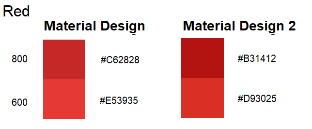
In these lines of code, which were made public by mistake for a few hours, the title of Material design 2, in addition to small changes in colors from various sections of Chrome. It should be remembered the importance of color in Material Design, which works as a visual clue for the hierarchy of the elements that are displayed on the screen. For example, in the following image you can see how the reds of Google Chrome would be modified in Android:
Another line of code also refers to the touch capabilities of the browser, under the heading flag IsTouchOptimizedMaterial (). This seems to indicate advances in the use of Chrome OS as the primary operating system for tablets, something that would be working with Material Design 2. In addition, the Chrome tabs would also modify their appearance.
All this is deduced from some lines of code published by mistake and that have been hidden once they were discovered. This suggests that the veracity of the same is very high, and forces to be attentive to the next movements of Google. At the moment there are only these clues regarding the use of color and improvements for Chrome OS, but it remains to be seen future additions to usability, perhaps incorporating new menus in the lower area of the screen like the ones that are testing in the beta of Chrome for Android.