Spotify is the most popular music streaming service on the market. It is used by thousands of people daily, even as an alarm clock. From the company they usually do tests on their servers with small changes in their application, and now they are testing a new simpler interface in your Android app.
Will I already see the changes in the interface?
If you open the Android app now, you may see the changes and you may not. Spotify works by performing A / B tests on your servers. This means that you are classified as user A or user B randomly or by preset parameters. Once the split is made, Spotify applies the changes to only a group of its users.
It is for this reason that you may not yet be able to see the changes that are being made. They are only being applied to a sector of users, so it is a matter of sheer luck. However, there are already users sharing their experience, which allows us to see what changes have been applied.
Five to three tabs
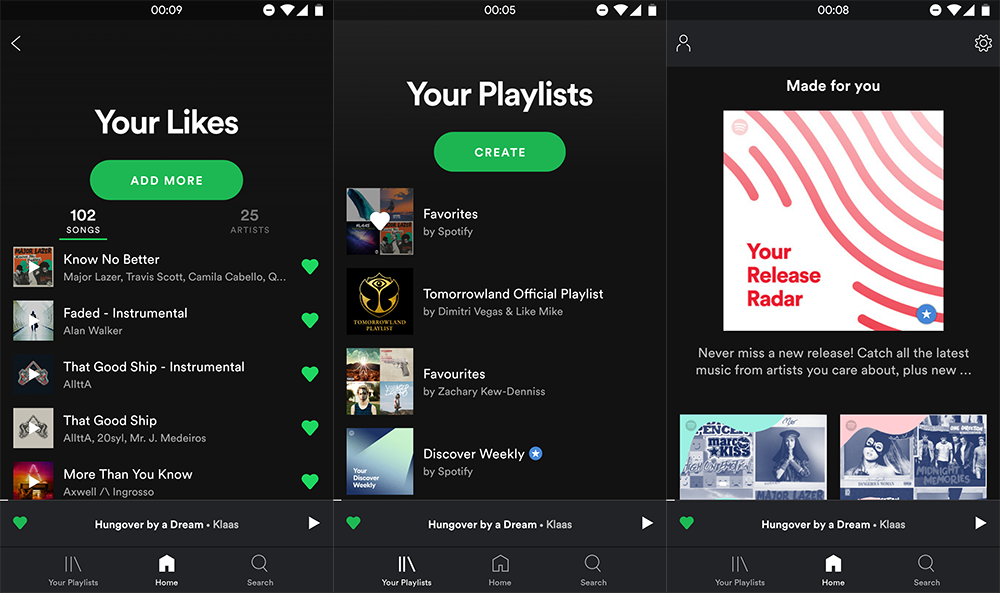
Currently, Spotify It has five tabs in its lower area: Home, Explore, Search, Radio and Your Library. The latest tests reduce them to three: Your Library, Home and Search. In this way the menus are greatly simplified, eliminating the two options most related to discovering content and focusing on what you have already saved and what you want to search for.
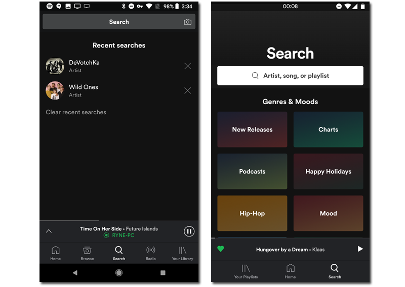
New search
In the image above you can also see the new appearance that the search. A constant throughout the redesign is simplicity and larger icons. Spotify is committed to something simpler and more visual, while making better use of dead spaces. Before, the search area was a black void only filled by your history. Now they are added recommendations of categories.
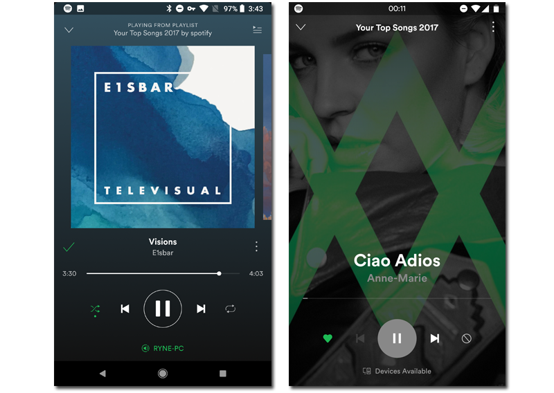
A full screen player
If we talk about the visual power of the new Spotify interface, nowhere is it clearer than in its new playback screen. The cover of what we are listening to takes more prominence, expanding its limits throughout the background for a more impressive experience:
Changes in the playlist, likes and Home
Finally, these same ideas already mentioned are applied to other sections. The playlists They are redesigned, being more visual but showing less information on the screen. The I like it the radio seem to move to a new section that suffers from the same defect, and the starting screen receives similar tweaks, as well as adding shortcuts to Settings and profile: