Recently a user asked me on Hangouts what icons were on my smartphone, which I had seen in a screenshot. I promised that I would dedicate an article to explain how I customize the interface of my Motorola Moto G, And what you promised is due. Launcher, icons, widgets, settings ... criticism and opinions are accepted.
Launcher
We will start with the launcher, since it is the basis of everything, and it is what allows us to modify the largest number of elements in the interface in a faster way. I have opted for Nova Launcher. It is one of the most downloaded, but I opted for it for a single issue, and that is that it allows you to increase the size of the icons. I came from iOS, and I have never liked that the icons that Android carries are so small, so I opted for this launcher for that reason. By the way, it must be said that the option to change the size of the icons is only available in the paid version of Nova Launcher, which is priced at three euros.
Google Play - Nova Launcher

Icons
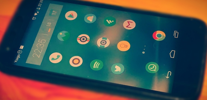
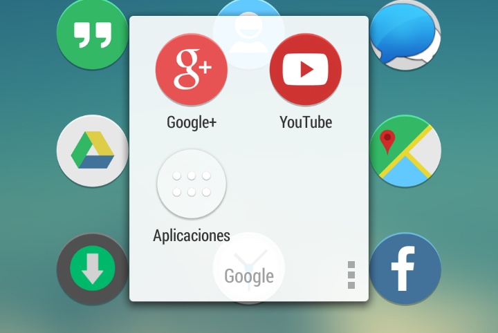
This time I have opted for Flatee. It seems to me that round icons are more fashionable than square icons, and that you also get less tired of them. Other than that, they're simple, and they look great on blurred wallpapers. There are more than 840 icons. What happens is that it costs money, 1,08 euros. However, it is compatible with many launchers, so if one day I change the launcher, I will be able to continue using them.
Google Play - Flatee
Wallpaper
Besides this, Flatee also includes 10 blurred wallpapers. They are very fashionable now, and the icons look great with these backgrounds. The wallpaper that I carry is one of those that come with the icon application.
Widgets
I wanted something simple, not to stand out from the icons, and useful. I chose Clock Now. It gives the time, includes the battery information, and the last button allows us to add a shortcut, or a configuration toggle. I have opted for the calendar, but it could be used to activate or deactivate the WiFi, for example. There are several aspect settings, I carry the one that shows the semi-transparent widget.
Google Play – Clock Now
Notification bar
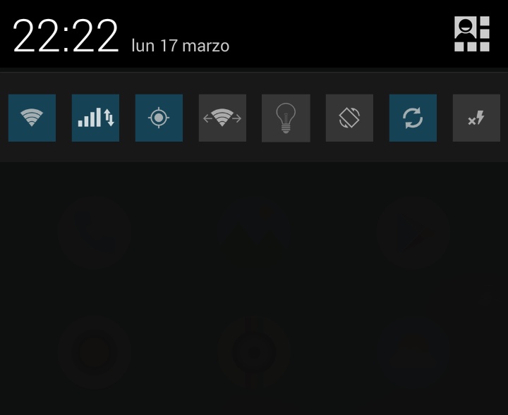
Here I am going to clarify a few things. My smartphone is not rooted, so I have not been able to make many modifications to the notification bar. You will not find the Settings icon on the Desktop, because I use the one in the second window of the notification bar. Being that one, he didn't need more. However, I have installed an application that I found very useful, Notification Toggle. What it does is what many smartphones already carry, but my Motorola Moto G does not, and is to add a list of shortcuts to settings to be able to activate or deactivate those functions from the notification bar. It allows you to choose the appearance of the icons, and download additional themes, the one that I have is SquareGlassJellyBean, which you can find in the list of downloadable icons that the appropriate application indicates.
Google Play - Notification Toggle
Launcher Settings
But it is not only a question of the launcher itself, but also of how to take it configured. I think Nova Launcher is one of the ones that gives more options. Choosing Nova is not like choosing a certain look, but like choosing a tool that allows you to create your own interface, and that is what I have tried to do. I never liked the look of the Android interface, which is why I always liked the elegance and style of iOS. Until I learned that the possibilities of Android were so wide, that the interface of that smartphone can be as beautiful or elegant as one wants and is capable. In fact, it is an opportunity to design your own interface. And that's what I did. I will tell you step by step the changes that I have made in the native configuration of Nova Launcher. If I skip any section of the Nova Launcher configuration, I am using the default configuration.
Desktop
1.- Desktop Grid: 5 rows and 3 columns. In a normal mobile we find 5 rows and 4 columns, which leaves us about 20 applications on the main screen. I find it totally useless to have 20 applications on the main screen. On my desktop I carry a widget that takes up a whole row, and I didn't need more than 12 main applications. In fact, no one needs them, so I opted for this setup. In the other windows of the desktop, instead of 12, 15 applications fit, as long as you do not have widgets, of course.
2.- Desktop margin width: The desktop margin seemed too large to me, especially when I wanted to gain space between the applications, so that they would appear clearer. Thus, instead of large, as is the default in Nova Launcher, I have opted for Medium. The upper and lower margins I have left in Large.
3.- No permanent search bar: I have plenty of Google search bar. My goal was to remove everything that was left over from the screen, and everything that I didn't use to. He almost never used that bar, but accessed Chrome and then did that search. In such a situation, he preferred to free up space. On the other hand, if you hold the Home button and then slide to the Google icon, you access Google Now, and you can search. Therefore, I have disabled this bar.
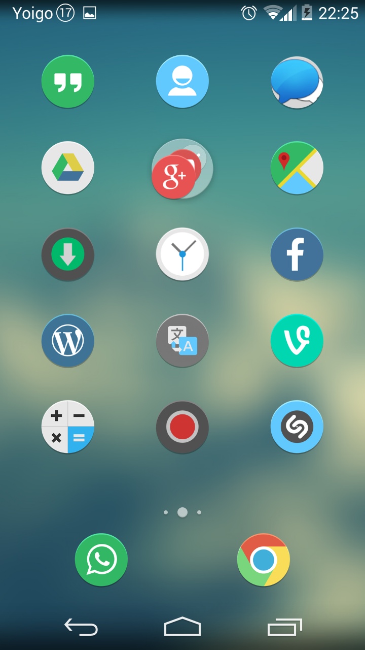
4.- Desktop Screens: Here I have gone back to the iOS style, because it seems more useful to me. I ignore the application drawer, going to make all the apps are on the desktop, in successive pages. And I make the main page the one on the left. The number of pages is defined by the number of applications I have on my smartphone.
5.- Displacement effect: I have chosen Launch. There are many, but I didn't want them to be boring, or too great. This one I liked.
6.- Icon labels: Here is one of the most important changes. After seeing many images of very elegant interfaces, with icon sets that I used, I did not understand why mine still looked as ugly as ever. I realized that it was all because of the names of the applications. So I disabled this option. I have found that with a good icon set, a blurred wallpaper, and a clear organization of applications, labels are not necessary on the Desktop.
App drawer
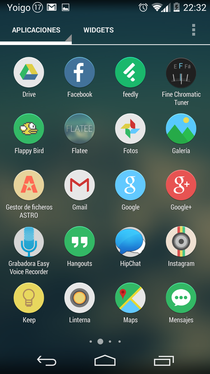
1.- Grid of the application drawer: I prefer the grid of 5 rows and 4 columns. I find it much clearer in the app drawer. It must be said that I do not use it, but even so I have an icon to access it from the Desktop, in case I had to use it.
Dock
1.- Dock icons: Perhaps this is what is most surprising of all. Instead of having five icons, with different pages, and a central button to access the app drawer, I only have two apps, or two icons, on the dock. They are the two that I use the most, WhatsApp and Google Chrome. Yes, I call on the phone, and I also use email, and Twitter, and the camera, but all of those apps are on the main desktop. The only two applications I need at all times are WhatsApp and Chrome, nothing more. When I have to use the others, I just have to press the Home button, and select them. I find that more comfortable than having a dock full of icons, which I don't use later. And of course, I do not understand those who have several pages in the dock, because, with that, the desktop and the application drawer become useless. If someone has it set up like this, that's fine with me and I respect it, it was just my opinion. On the other hand, with three columns, only two icons on the dock look great.
2.- Show Divisor: I have chosen for the divider to be displayed, it seems to me that it is much clearer, although depending on the configuration you have chosen, the opposite could happen.
Appearance
1.- Color theme: I have chosen white, instead of Holo blue, because it is the one that Android 4.4 KitKat now has.
2.- Icon theme: We have already talked about it. I wear Flatee. But there is a detail to take into account. If there is no icon for a certain application, it is best to look for one that looks like it, it will always be better.
3.- Size of the icons: This seems very important to me. I take them to 115%. It seems to me that the difference is enormous. And that in the aspect that I have wanted to give the mobile now, it is better that the icons are smaller so that the design looks good. Normally, with another design, you would use either 125% or 130%.
4.- Icon Font: Condensed. This is variable.
5.- Scrolling speed: I have modified this option, and instead of Nova speed, I have selected Fast speed, which is faster than Nova's. Desktop panel scrolling animations are worthless. If we remove them, they don't look good either. The best thing is that you try all the options, and see which one seems most useful to you and which one is better.
6.- Transparent notification bar: I have selected this option because in Android 4.4 KitKat the notification bar and the bottom bar with the virtual buttons become transparent. It only works with smartphones with KitKat or later, so if you don't have this version, you won't be able to activate the option.
new applications
1.- Automatically add shortcuts: Since I don't want to use the application drawer, I want it to add its icon to the desktop every time I install an application. So I have this option selected.
2.- Use other pages if the current one is full: Of course, for the applications to be added automatically, I also need the icon to appear on another page if a page is full, that is why I have selected this option.
Note: Play Store settings: If you have the original mobile launcher, or you have any other launcher installed, it is possible that every time you install an application from Google Play, it creates the shortcut in those launchers. That is not a problem, until all the pages of that launcher have been filled and each time we try to install an application a message appears informing us that there is no space on the screen to add the direct access to that application. If we click on the Nova Launcher option, it will take us to Google Play, so that we deactivate the option to Add widgets automatically, as it is a task that Nova Launcher already performs automatically.
clarifications
As a small final clarification, I must say that although I use the main desktops to host all the applications, I also have an access to the application drawer. I have a folder in the second window where Google Plus and Youtube are, and there I have the application drawer icon, in case I ever had to access it.
Finally, I would like to give some guidelines for positioning the icons on the screen. We tend to think that the one in the upper left corner is the most important, but this is not the case. Actually, the most important is the one in the lower right corner if you are right handed, or left if you are left handed. If you have a smartphone with a five-inch screen, it will be difficult to reach the icon in the upper left corner, but it will be very easy to press the icon in the upper right corner. Keep this in mind. I, for example, carry the Telephone in the upper left corner. It looks good, and I call little, so I have no problems not using it a lot. However, the email icon, from Gmail, is in the lower right corner. I use it a lot. So it must be close. Finally, do not forget the colors, sometimes it is better to separate those that are the same color, to avoid collapsing the color image.
I accept criticism and opinions. I hope to be able to give more guidelines and ideas about different configurations and designs for the Android interface. It is a very simple way to change your mobile, and never get bored with the one we have.
Very cute and interesting, I will try it but on my moto x
Some tips / tricks to save ram memory ???
Download the clean master is free from the playstore, it is a very good program and it frees up RAM.
Someone has had a problem with the Touch screen. It stays fried and I have to be blocking and unblocking (when it lets me put the pattern).
It's excellent ... practically the same as me, same wallpaper, same icon pack, same launcher, etc.
The Minimalistic + Flat design is very fashionable and looks good!
Brother can you tell me an icon theme that looks like flatee, thanks.
a question ... if I set Nova Launcher as my specific interface, does that affect when I want to use the old interface again?
calmly from the settings you can reinstall the previous interface or another that you have installed, or the native interface ... I have tried several launchers and Nova Launcher is the one I liked the most ...
Hi, I wanted to know if I can change the color of the battery instead of being white and blue like the razr
The size of the icons is paid 🙁 but very good contribution. Thanks
Hello, what application do you use to display the circle with the battery percentage inside? Thanks
very good job bro can you help me? ... I need to know how to create an icon theme for the nova launcher and apply them to my cell obviously.
«It allows you to choose the appearance of the icons, and download themes
additional ones, the one I wear is SquareGlassJellyBean, which you can
locate in the list of downloadable icons that the application appropriates
It tells you. »
I did not understand that part very well, I cannot find a way to change the appearance of the icons in the Toggle Notification. I would appreciate it if you could send me a screenshot or simple instructions.
Hello… Can someone tell you how to cancel or delete events created in the moto g calendar? Thanks!!
how to change the shape of the start clock
As I do to place the mail in a tab, but that it occupies the entire ppr, I mean see the mails.
Thank you
"If there is no icon for a certain application, it is best to find one that looks like it, it will always be better" how can I do this?